We build how brands show up.
Nine at a time.
SUITE NINE is a private creative office in Riyadh. It has nine seats. Each seat is one brand and one ongoing relationship: strategy, identity, content and campaigns, run from the same room by the same minds. When the ninth seat is taken the door closes. It opens again when a seat is vacated.
The office does not compete on size. It has never counted its projects and does not intend to start. What it has instead is a point of view, and the capacity to apply it to nine brands properly rather than to ninety brands in passing.
This site is the office's file. Three chapters record what the office does. One register shows who is in the room. Admission is at the end.
01Identity
An identity is not a logo. It is the set of decisions a brand makes before anyone is watching: what it says, what it refuses to say, how it holds a page, how it sounds at nine in the morning and at midnight. We start with the decisions. The marks come later, and they come easier, because by then they have somewhere to sit.
The office has built identities for coffee, for restaurants, for fashion, for real estate, for software01. The method does not change. Reduce until only the idea is left. Then make the idea usable by people who are not designers: the barista, the cashier, the receptionist who prints the sign. A system that needs its designer in the room is not a system.
A point of view, in writing. A wordmark and the rules for it. Typography that does the talking. Colour used as an event, not as wallpaper. Paper, packaging, signage, uniform, screens — each one a different composition of the same mind.
The brand should look like it existed before anyone saw it. Nothing in it exists only to look good. If a piece could have come from any studio, it goes back.
Same mind. Different output.
02Campaigns
A campaign is a brand leaving the building. For a few weeks it is louder than usual, it goes to places it does not normally go, and then it comes home. The test of a good one is simple: did people notice, and did the brand come back the same brand.
We build campaigns from one idea, stated in one sentence, that we could defend at a table with no slides. The idea decides the media, not the other way round. Some ideas want a billboard. Some want a receipt. Some want one post and a lot of silence.
Everything is produced inside the seat. The strategy, the writing, the photography direction, the film, the print, the placements, the timing — one room, no hand-offs, no agency-of-record and agency-of-the-day. The people who wrote the idea are the people who watch it land.
Launches. Openings. Seasons. Collaborations. Ramadan and National Day, when everyone shouts at once and the quiet brand is the one that gets heard. And the campaigns nobody asked for, which are usually the ones that work.
The idea decides the media.
03Social
We manage accounts. We say this plainly because most offices that do it will not, and most that do it, do it badly. The feed is where a brand is seen most and thought about least, so it is where an identity either holds or falls apart.
An account run from this office is a living archive, not a content calendar. It records what the brand made, sold, said and saw. No templates. No tips. No quotes. No logo on every post. A photo taken on a phone in the kitchen can carry more of the brand than a rendered mockup ever will, if the eye behind it is right.
Every seat runs on a monthly cycle: what will be shot, written, made and published, and by when. Members see the cycle before it runs. Nothing goes out without a yes. A scheduled post that does not go out is our failure and is treated as one.
The account manager is a person. The archive is a system. The point of view is ours, and it is the reason the account looks like the brand and not like the platform.
Say less. Show the work.
The roomhas nineseats.
A seat is one brand, held for as long as the relationship lasts. Members are not named here; their work is in the chapters. When the ninth seat is taken, admission closes and a waiting list opens. A vacated seat is offered to the list first.
Nine is the capacity of the room. It is not a campaign and it will not become ten.
Take aseat.
Admission is a conversation, not a form. Write to the office with the name of the brand, what it does, and what is not working. We reply within three working days. If a seat is available and the fit is right, we meet — in Riyadh, or on a call.
Pricing is decided per seat, in that conversation, and nowhere else. There are no packages, and there is nothing to download.
- Writeadmission@suitenine.sa
- Instagram@suitenine
- OfficeRiyadh, Saudi Arabia
- HoursSun – Thu, 10:00 – 18:00 AST



1886×Raketa
What left the office
1886 came to the seat with a partner signed and a watch on the bench. Everything around the watch was ours: the identity of the collaboration — a mark that holds two houses without either losing its name — the creative direction, the photography, a 3D rebuild of the watch, and the films cut from it.
- Collab identity
- Creative direction
- Photography
- 3D
- Film
- Apparel line
- Packaging
Setting the scene
In 2024 a partnership was formed between 1886, a Saudi fashion house, and Raketa, a Russian watchmaker founded in 1721. Three centuries of watchmaking meet an apparel brand that has never asked for permission.


Why 1886 × Raketa
Both houses respect tradition, want innovation, and refuse to ship what does not last. Different industries, one rule. Together they set out to change what the Saudi market expects from the words luxury and craftsmanship.
Introduce Raketa to a high-potential market. Saudi Arabia is one of the fastest-growing luxury markets in the world, and Raketa had never been presented to it properly.
Position 1886 as the trendsetter. The first regional apparel brand to collaborate with a legacy watchmaker.
Raketa — a legacy of time
Founded in 1721, Raketa is one of the oldest watch manufactures still running. Made in Russia, built for harsh conditions, worn by cosmonauts and polar explorers — people who need the time more than they need the watch.
1886 — a pioneer in Saudi fashion
Founded in Saudi Arabia, 1886 became the reference for what fashion-forward means in the region: modern construction with cultural memory in it, made for the generation that grew up with both.
The watch
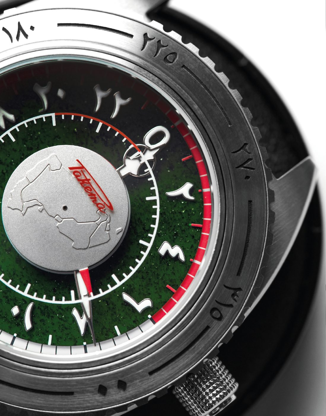
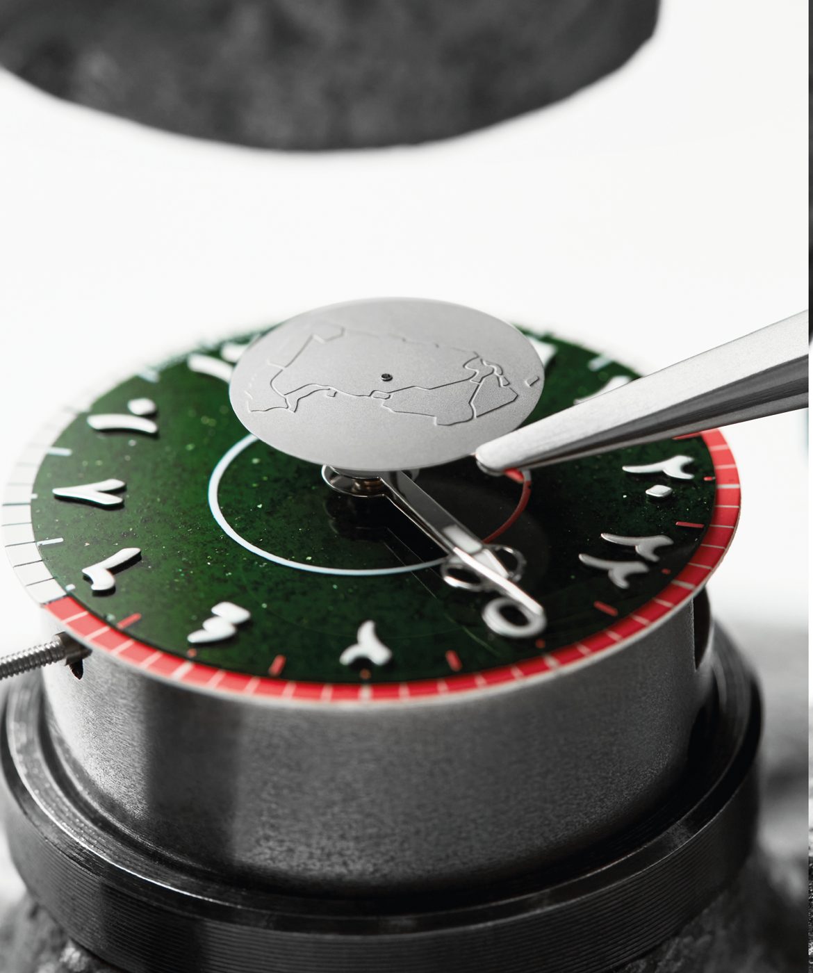
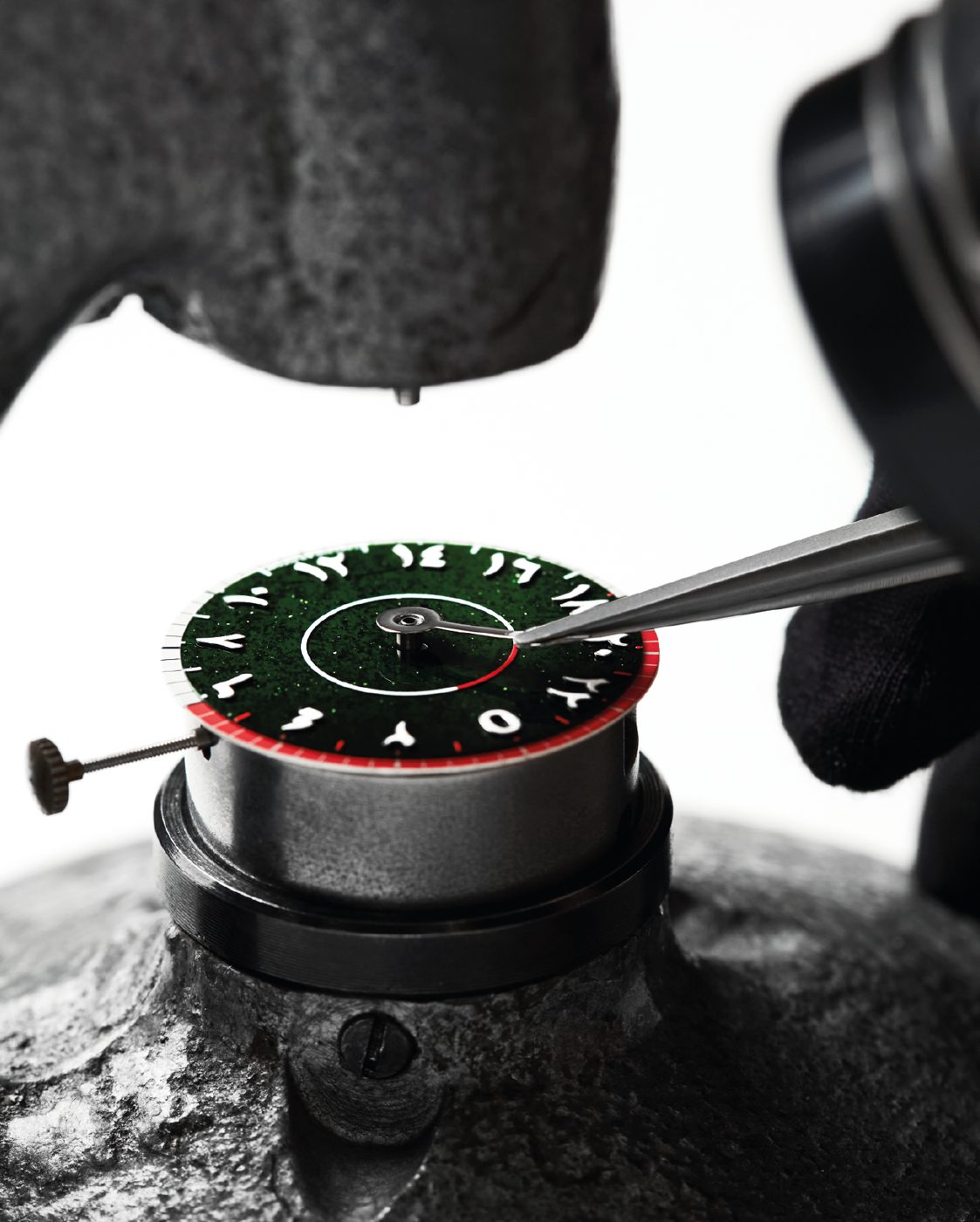
Raketa brought the movement, the case, the manufacture. 1886 brought the point of view: a dial that reads the Gulf's day in the Gulf's numerals, on a stone from the earth, with the country turning at its centre.
The 3D build
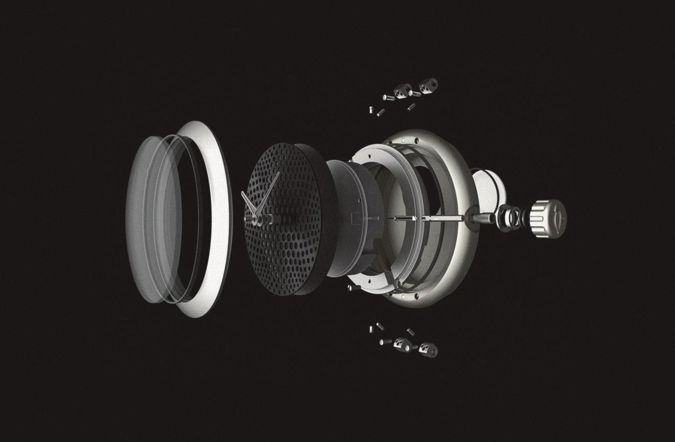
The watch was rebuilt in 3D for the shots a camera cannot take — the case opened, the crystal lifted, the disc from underneath, the stone lit from inside. Every frame of the film comes from this build. Three film treatments were written against it: Journey Through Time, Engineering Unveiled, Space-Time Continuum.
The apparel
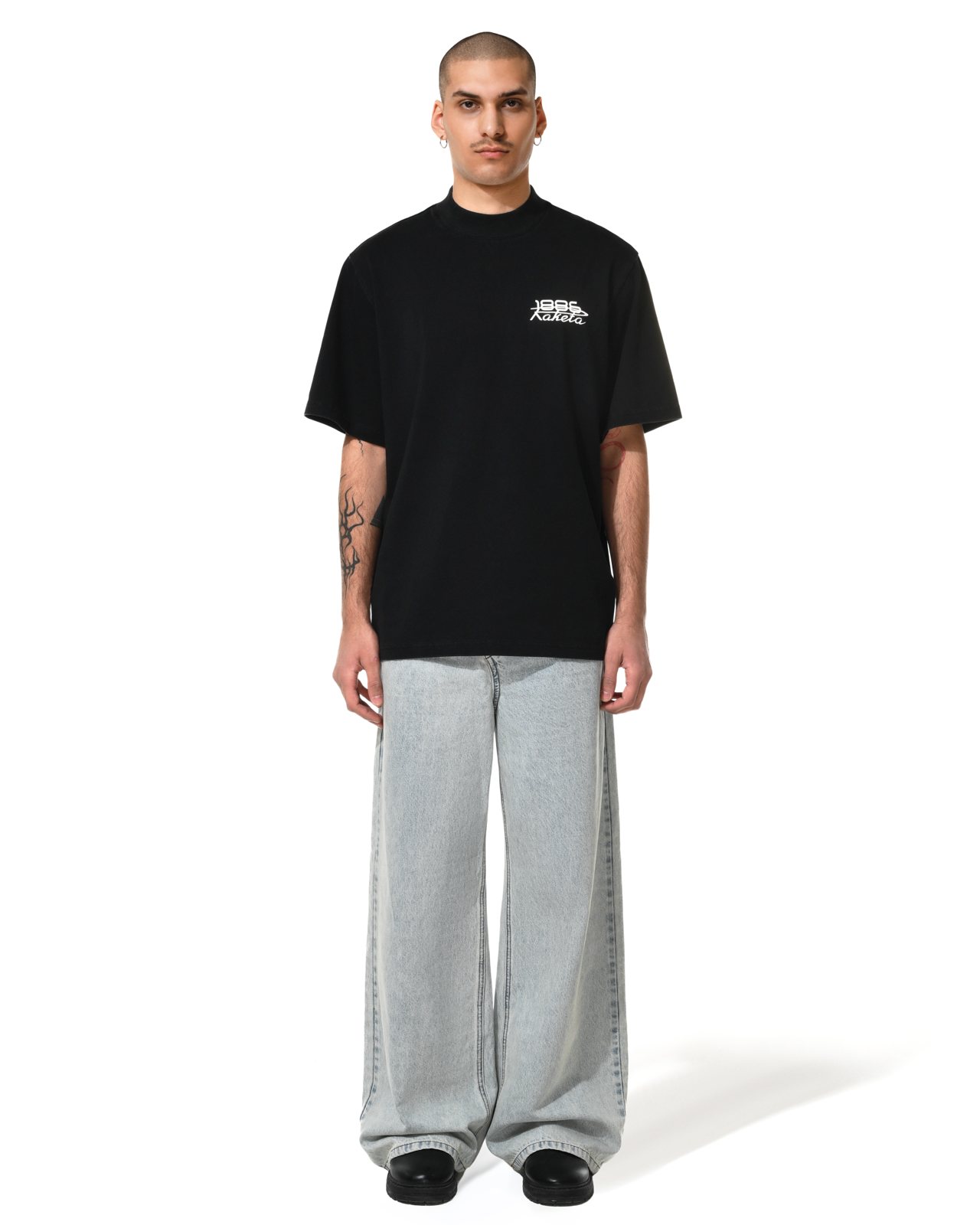
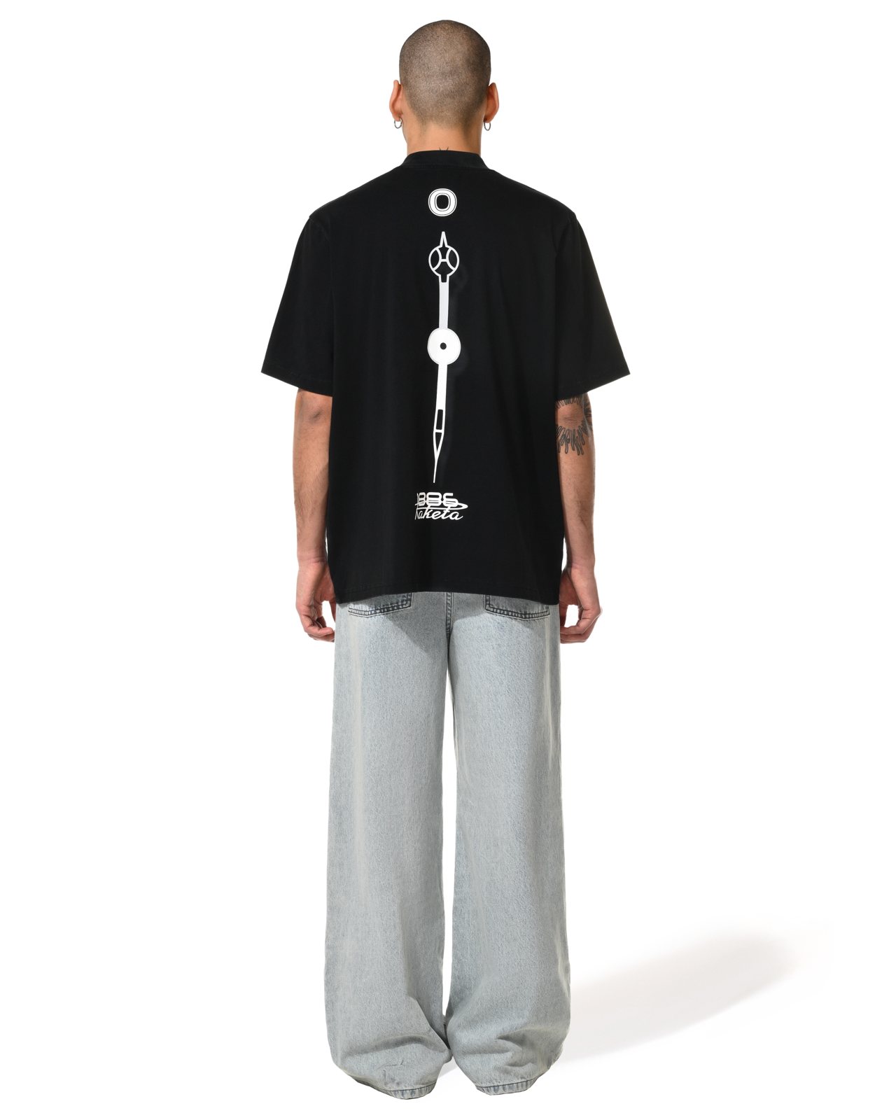
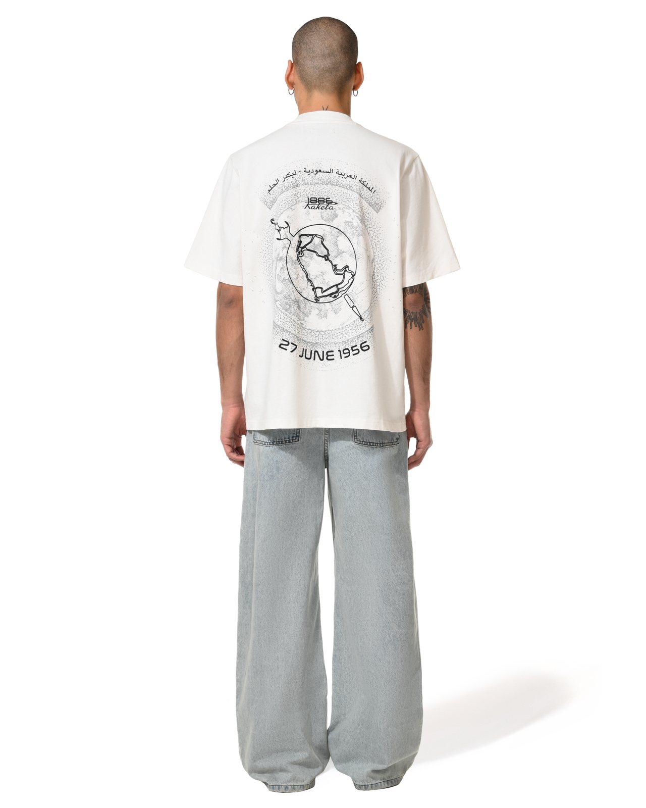
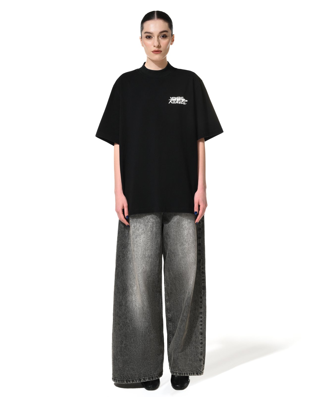
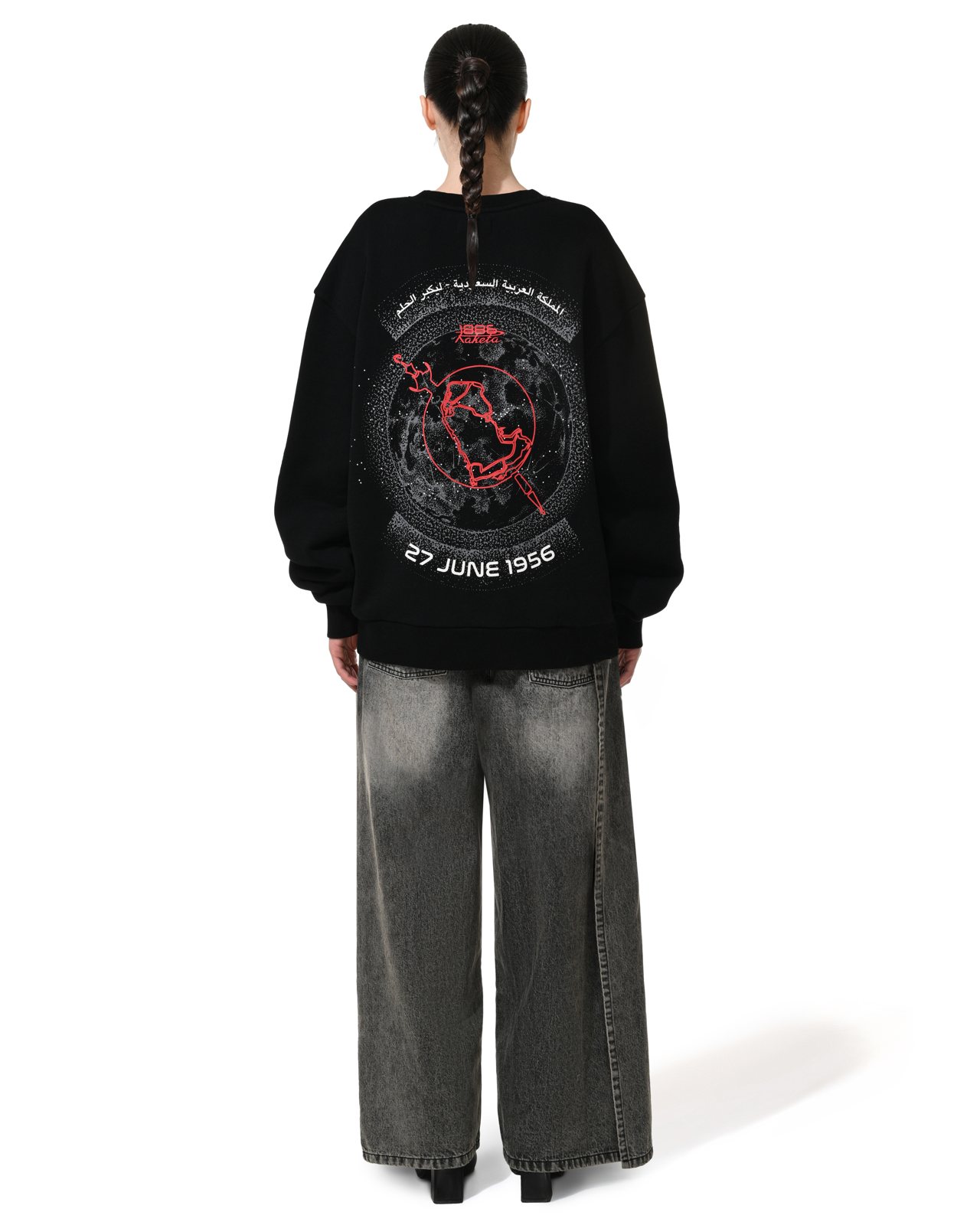
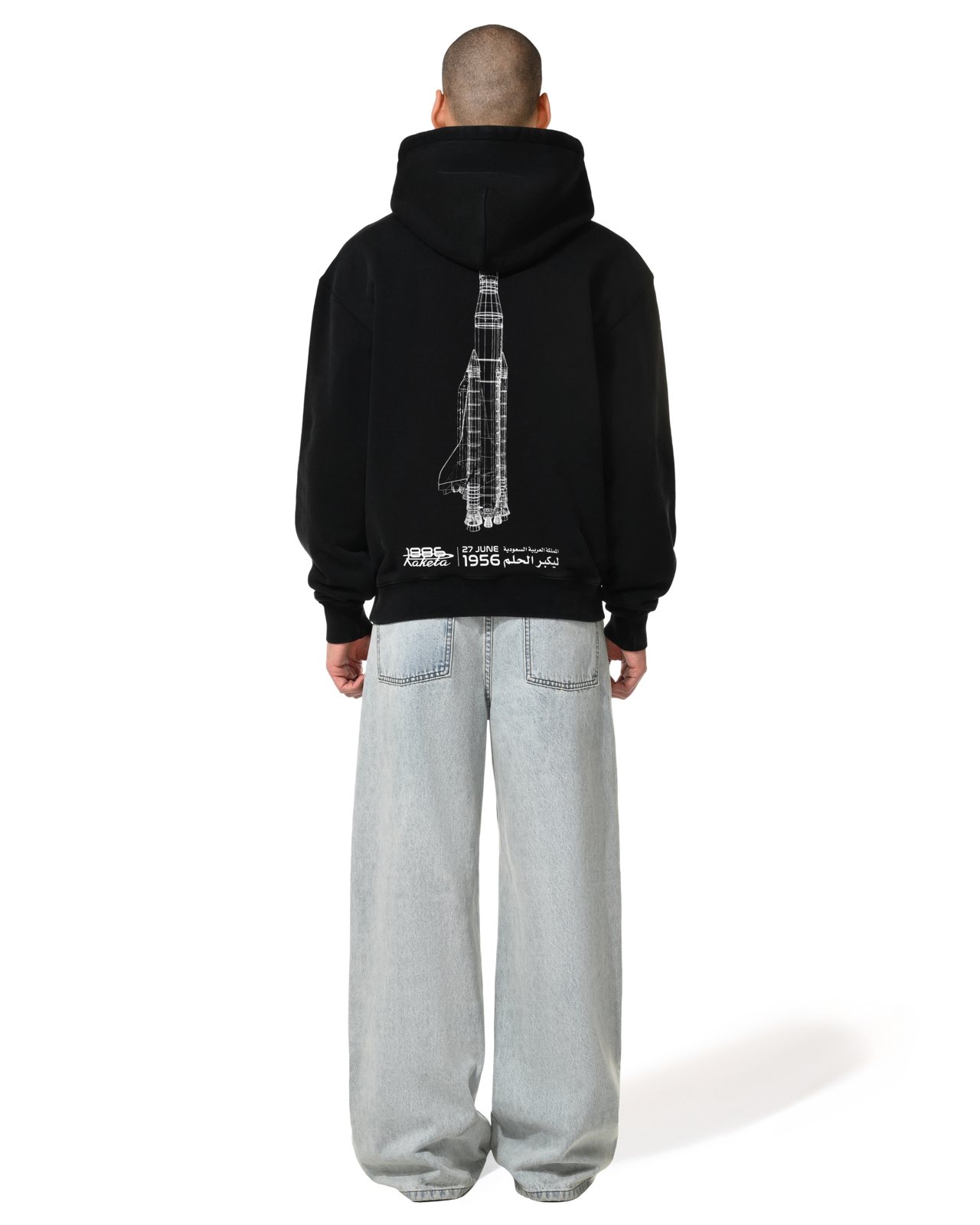
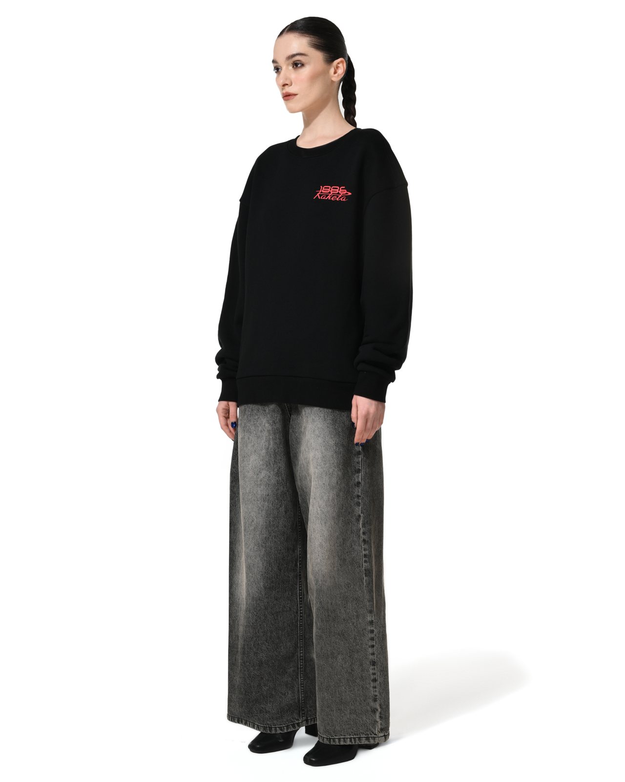
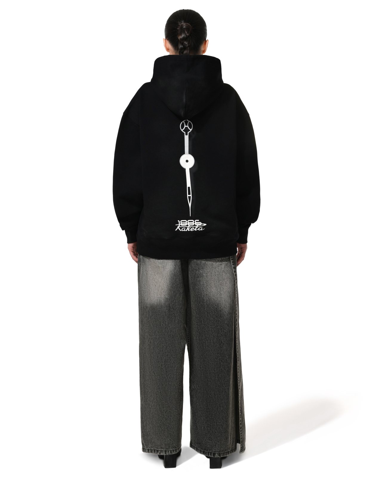
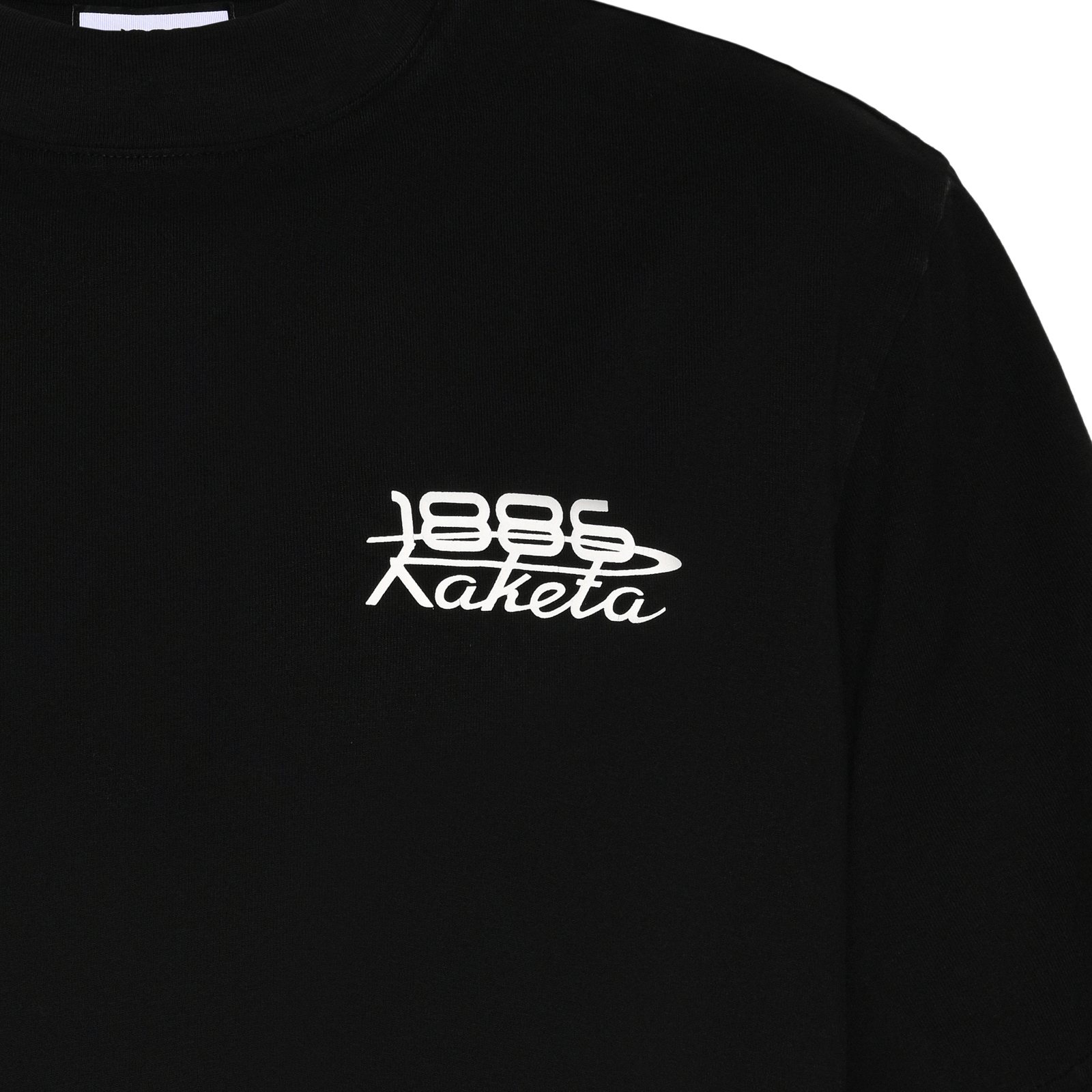
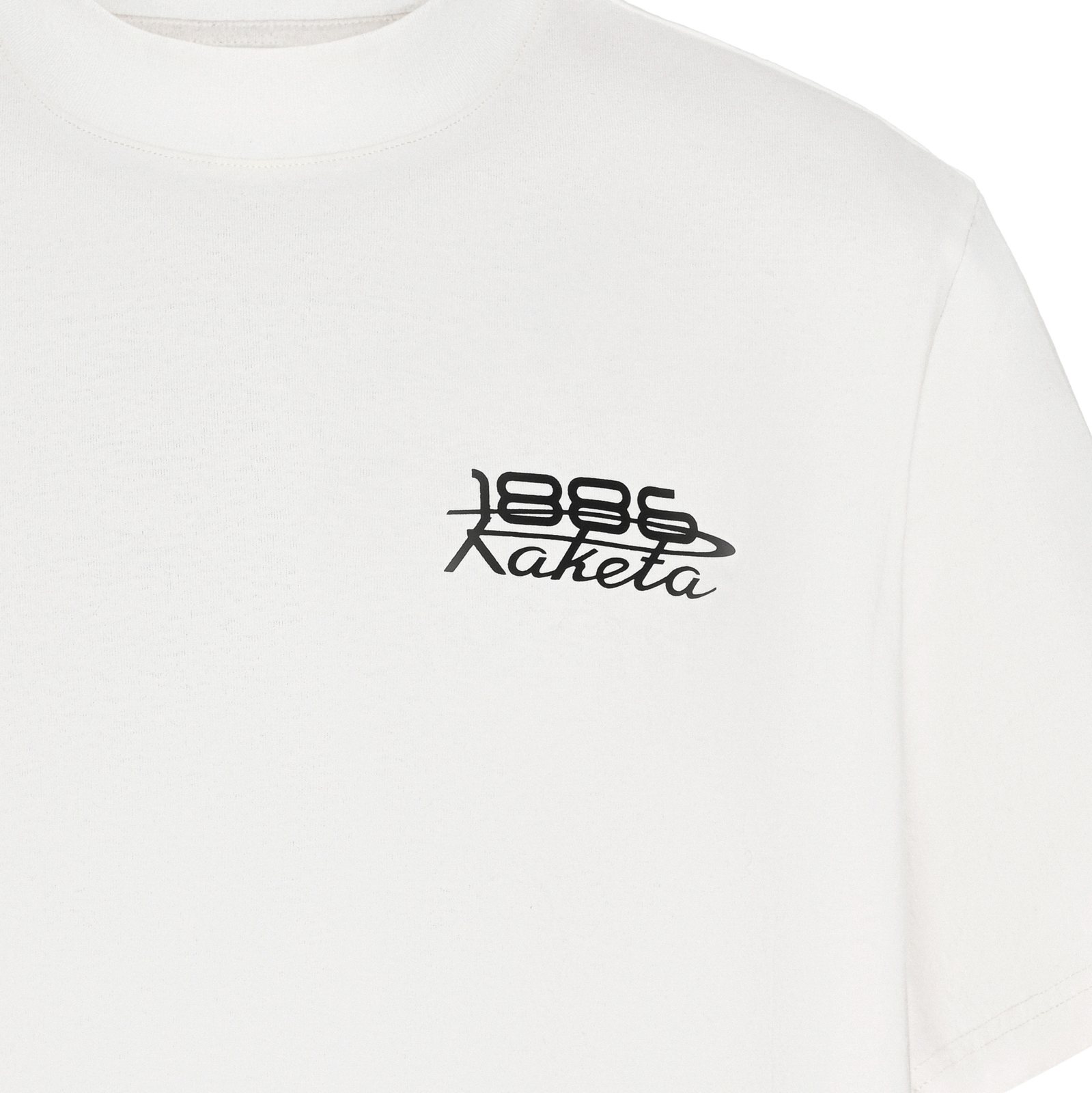
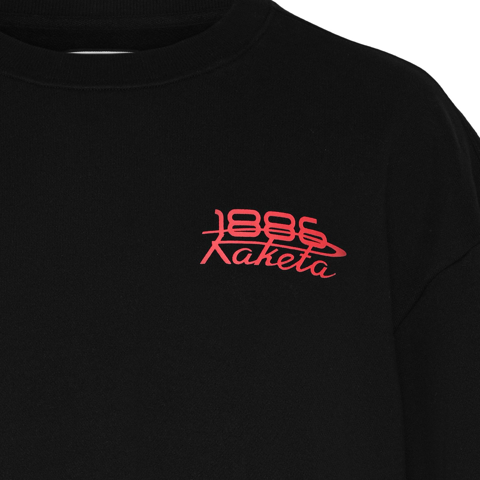
A watch collaboration from a fashion house has to be worn before it is worn. Tees, hoodies and crews carry the collab mark on the chest and the Raketa rocket down the spine — the line the watch sits beside, not on top of.
Packaging
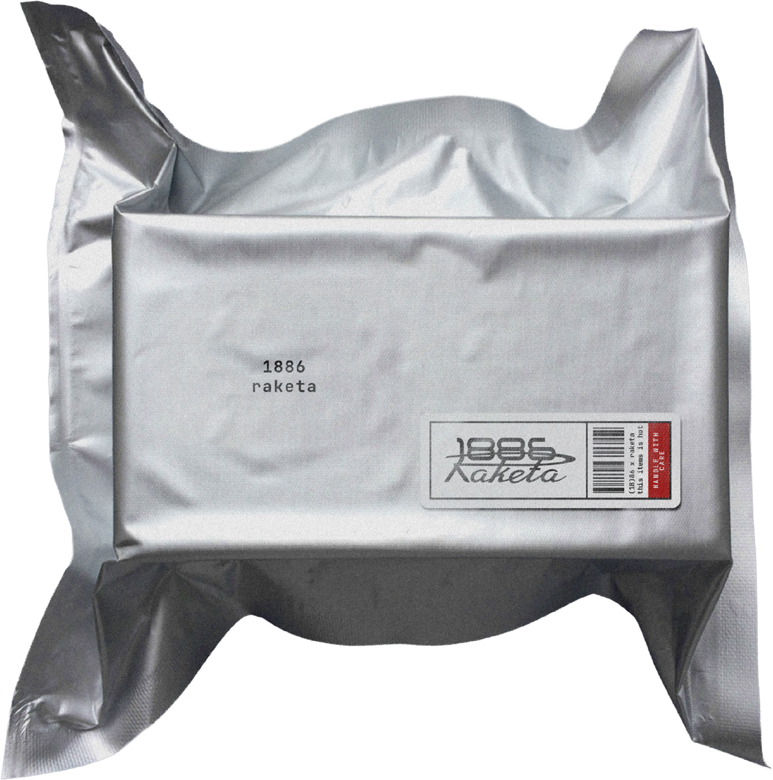
A watch of this kind usually arrives in a lacquered box. This one arrives sealed in foil, like an instrument, with a barcode and a red label that says handle with care. The box is the first thing a customer touches. It should tell the truth about what is inside.
Looking ahead
Raketa enters a market it had never entered. 1886 proves a Saudi house can sit at the table with a 300-year-old manufacture and hold the pen. The collaboration is the start of a category, not the end of a campaign.
Timeless elegance, boundless vision.
Two distinct worlds, one shared vision. A record of time, tradition, and the future of fashion in Saudi Arabia.
DaNonna
What left the office
Da Nonna came to the seat as a working restaurant with a brand that no longer said what the food said. We rebuilt it from the name down: the identity, the mark and its system, the cups, every piece of packaging, and the customer experience from the door to the last bite — so that the thing a customer holds, sits at, and carries home all come from the same kitchen.
- Identity
- Mark & system
- Cups
- Packaging
- Customer experience
- Character
The house
Da Nonna is an Italian kitchen and café in Riyadh, founded in 2022. The name is the promise: made by the grandmother. Pasta, bread, pastry and coffee done the slow way, in a city that mostly does them the fast way. It grew from one room to a renovated branch in Al Raed and a new one under construction in a Solitaire mall.
The food kept the promise. The brand did not. That is where the file opens.
The mark — four steps
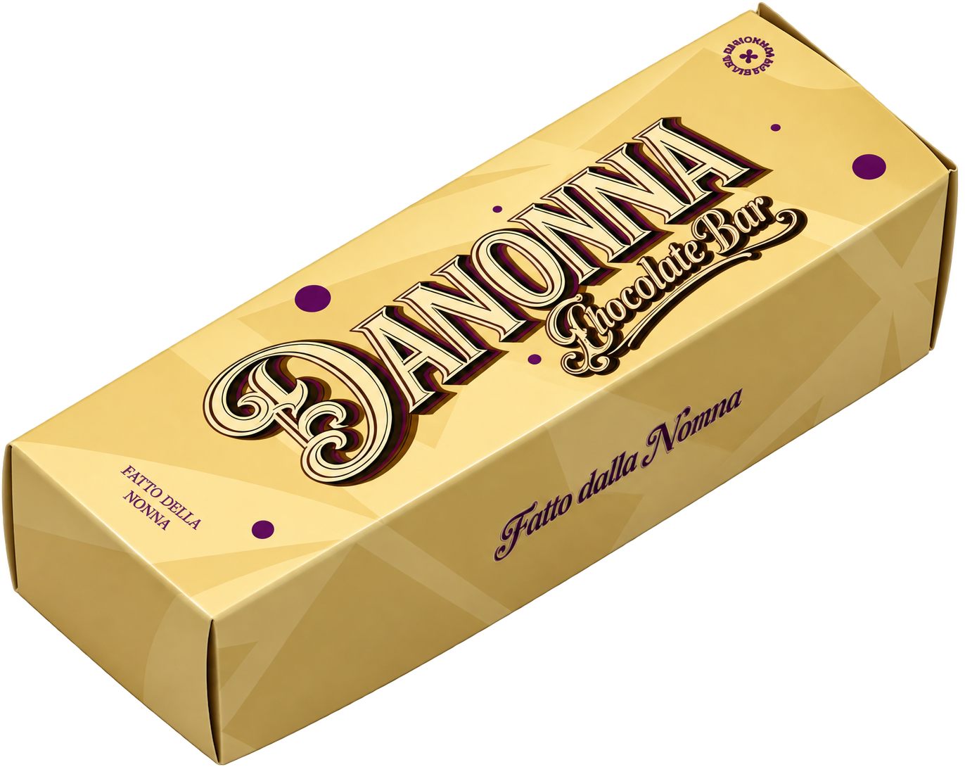
From a typeface to a painted sign. Old on the left, the mark on the right, and the two drawings in between that got it there.
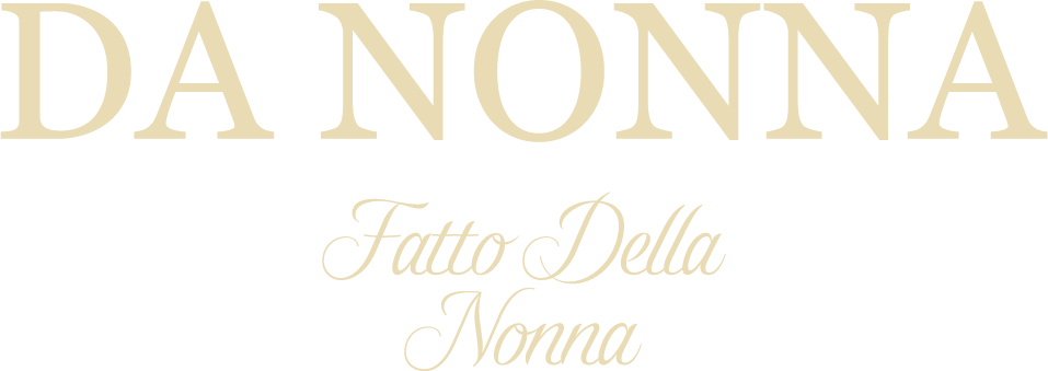
Serif capitals, a script line underneath, set from a font. Correct and quiet. It could have been any café's.

The name becomes one word: DANONNA, the way it is said. The letters go tall and condensed, the D grows a flourish, the line moves on top and is corrected to Fatto dalla Nonna. Everything still loose, drawn by hand, on a slant.
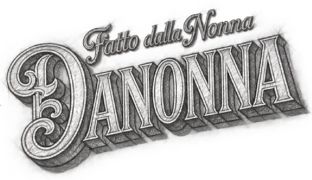
The sketch is drawn properly. Each letter gets an inline and a hard block shadow, so the mark stands off the surface like paint on a window. The slant is fixed, the spacing tightened, the flourish resolved.
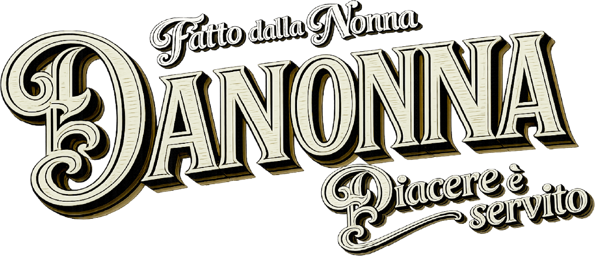
Colour and the second line. Cream letters, cocoa shadow, and Piacere è servito swinging under the name. Vectorised so it holds on a chocolate bar and a shopfront alike.
The turn
We stopped designing a café and started drawing a kitchen. The new world is hand-made and warm: cream and tan tiles with a rose in every other square, a marble table you can lean on, a mark that looks stamped rather than typeset, and a character — the nonna herself — who can live on a cup, a box, a wall, a sticker, or the corner of a website, and be recognised from across the room.
Not a café that serves Italian. An Italian kitchen that happens to be in Riyadh.
Cups & packaging
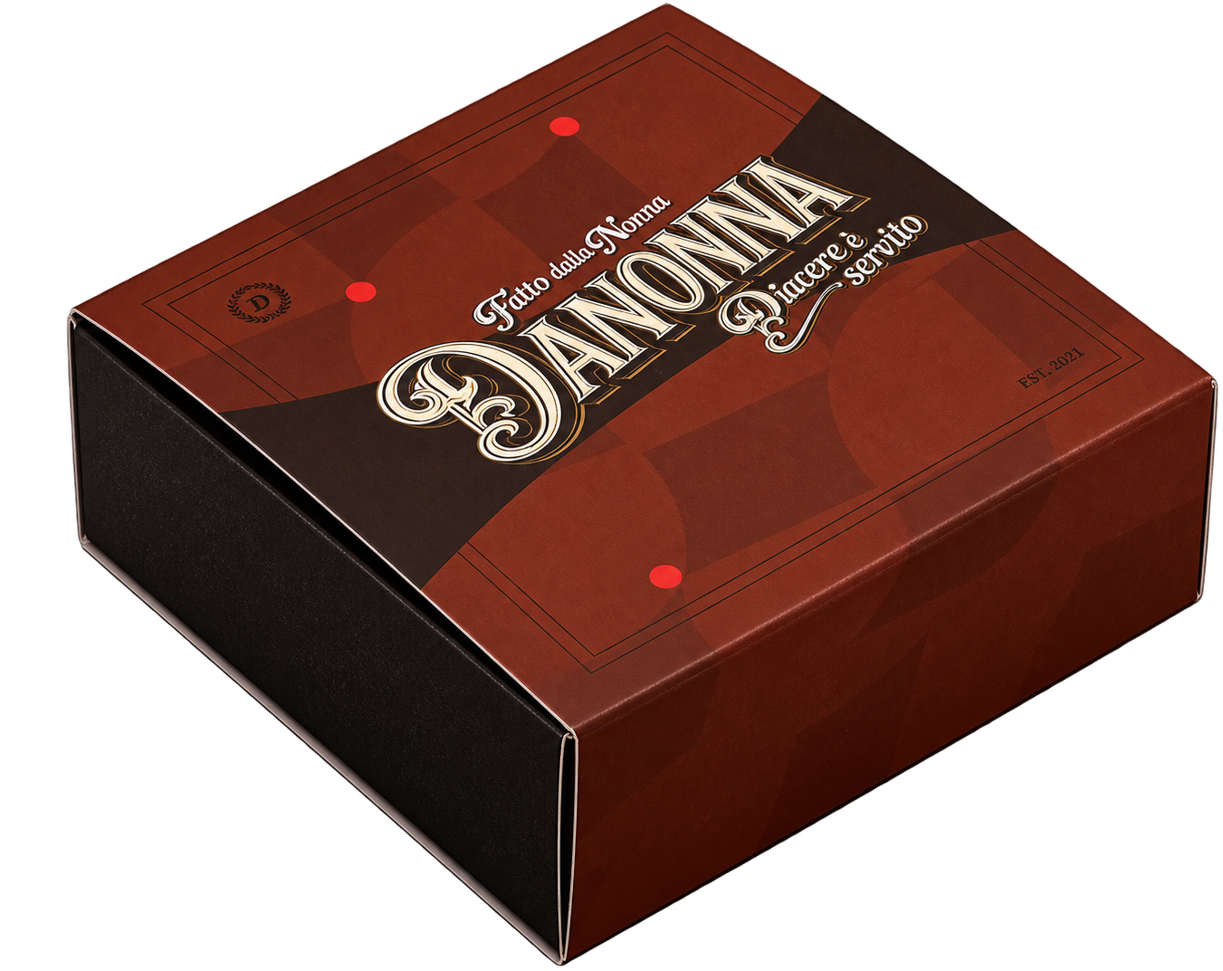
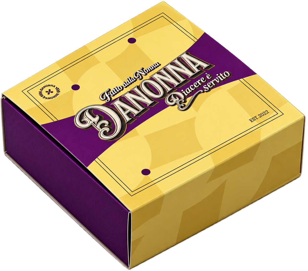
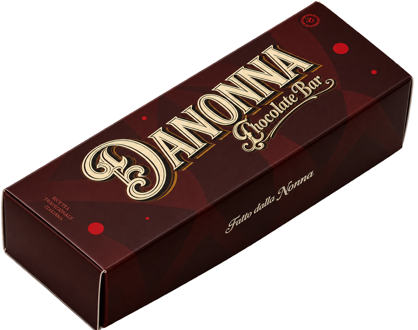
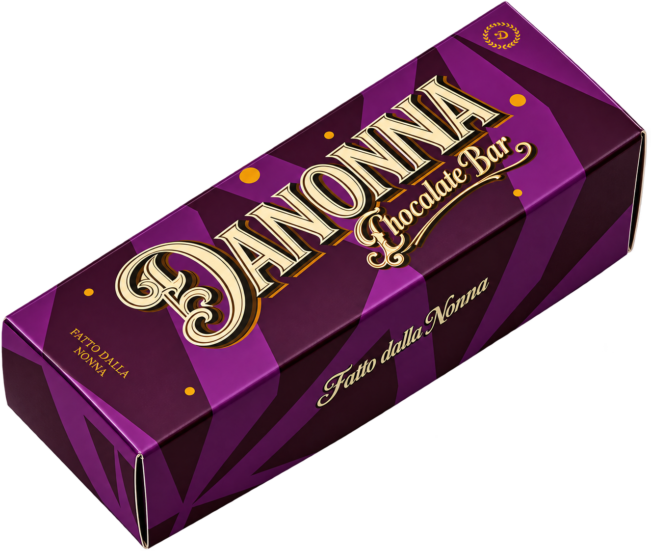
The cup is the most-photographed object the brand owns, so it was designed first. Then the boxes, bags, sleeves and labels — one family, one set of rules, printed on stock that feels like paper and not like plastic. Each piece carries the tiles, the mark, and the nonna, in different amounts.
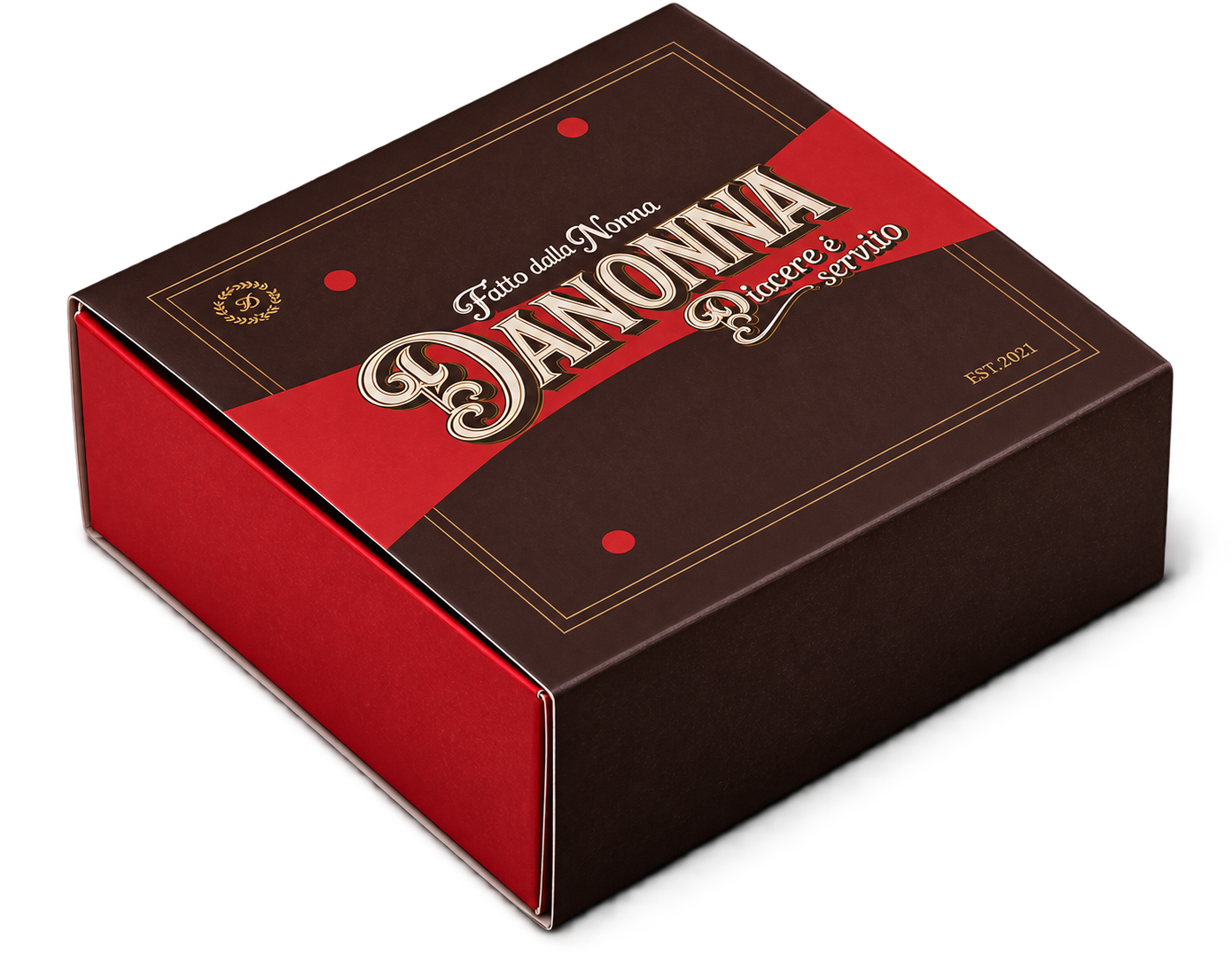
Customer experience
An identity is only finished when a stranger can feel it without reading it. We wrote the sequence — the door, the greeting, the menu in the hand, the order called by name, the cup set down, the box folded, the goodbye — and designed each touch so it belongs to the same grandmother. Staff language, the way a receipt reads, what plays in the room, what the delivery bag says when it arrives cold.
Same kitchen. Every touch.
The nonna
She is the brand's signature and its mascot at once — drawn once, used everywhere. On this page she is loose: she falls in, you can pick her up and throw her, and she always lands on the table.
Fatto della nonna.
Made by the grandmother. Now it looks like it.

What left the office
A social campaign for a specialty coffee house in Riyadh: the idea, the direction, the product photography, and a series of short films — directed, generated and cut inside the seat. No crew, no location, no day rate. Nine films for the feed, seven studio clips for the products, and a set of stills on a single red.
- Campaign
- Creative direction
- Product photography
- AI film
- Feed
The house
Dust & Verse is a specialty coffee house in Riyadh with two rooms, Al-Takhasusi and Al-Andalus. Serif name, burnt-orange ink, a cup people photograph. It needed a feed that looked like the cup felt.
The world
The campaign borrows a decade, not a trend. A woman in a black dress and gloves, a paper cup, a croissant in a napkin. A drive-in cinema with the name on the screen. A facade with the right cars parked outside. Riyadh, if Riyadh had been filmed in 1961. Nothing explains the coffee. The coffee is simply there, in every frame, in her hand.
She never puts the cup down.
The films
Nine, fifteen seconds each, 9:16, cut for the feed. Drag the strip. The frame in the middle plays.
Product, on red
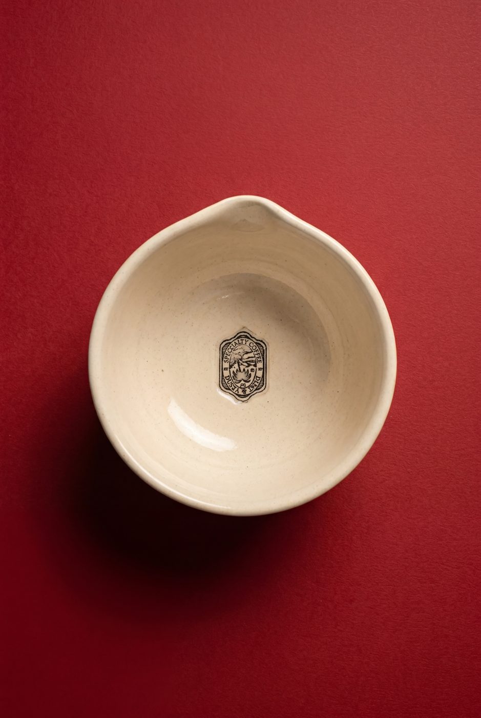
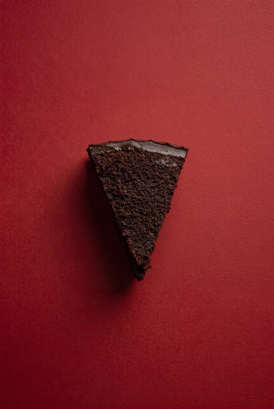
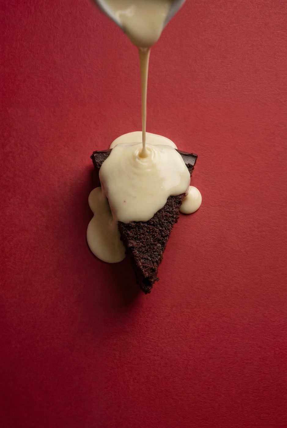
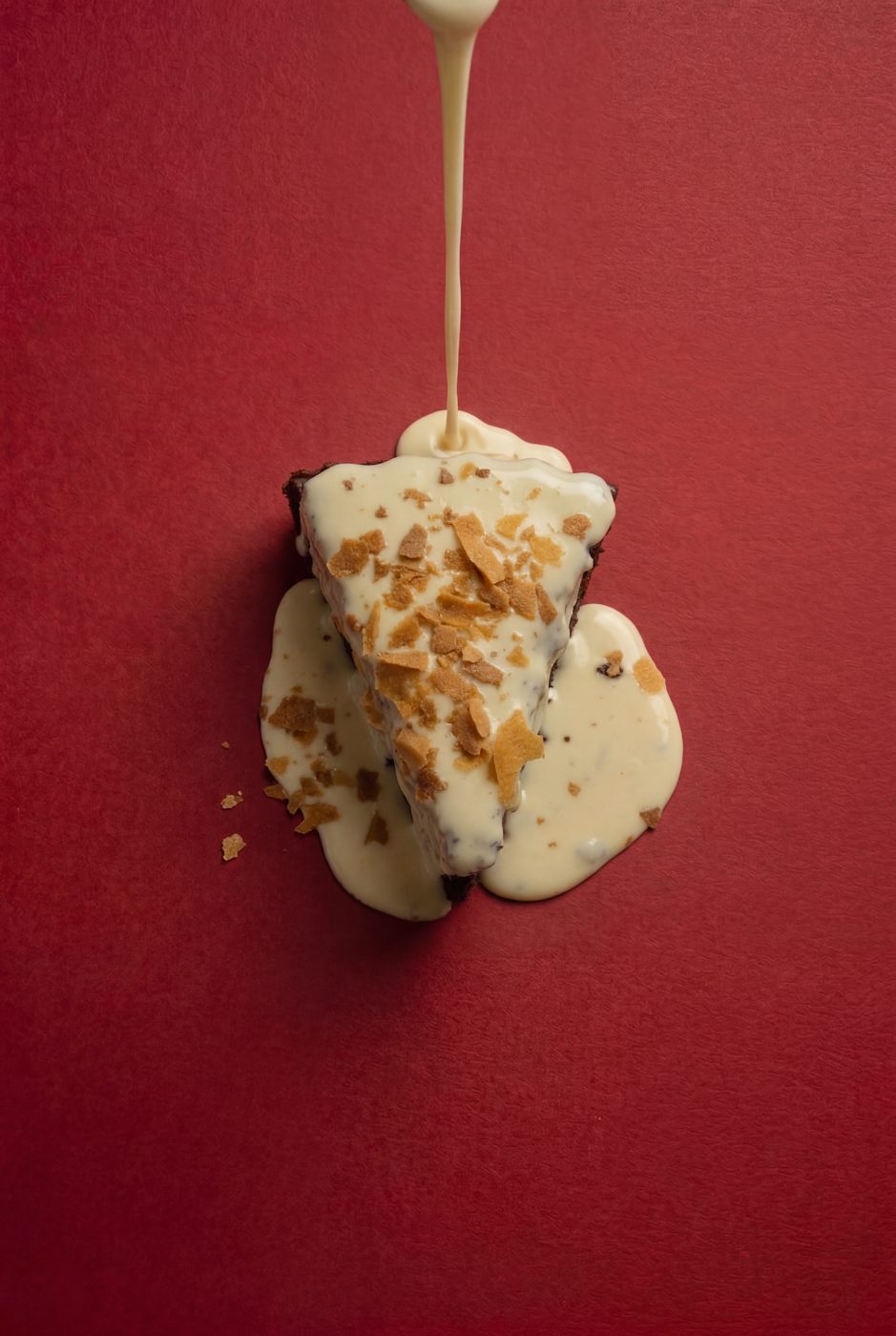
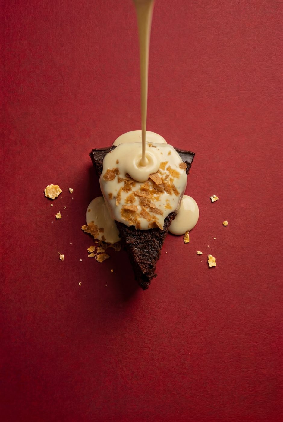
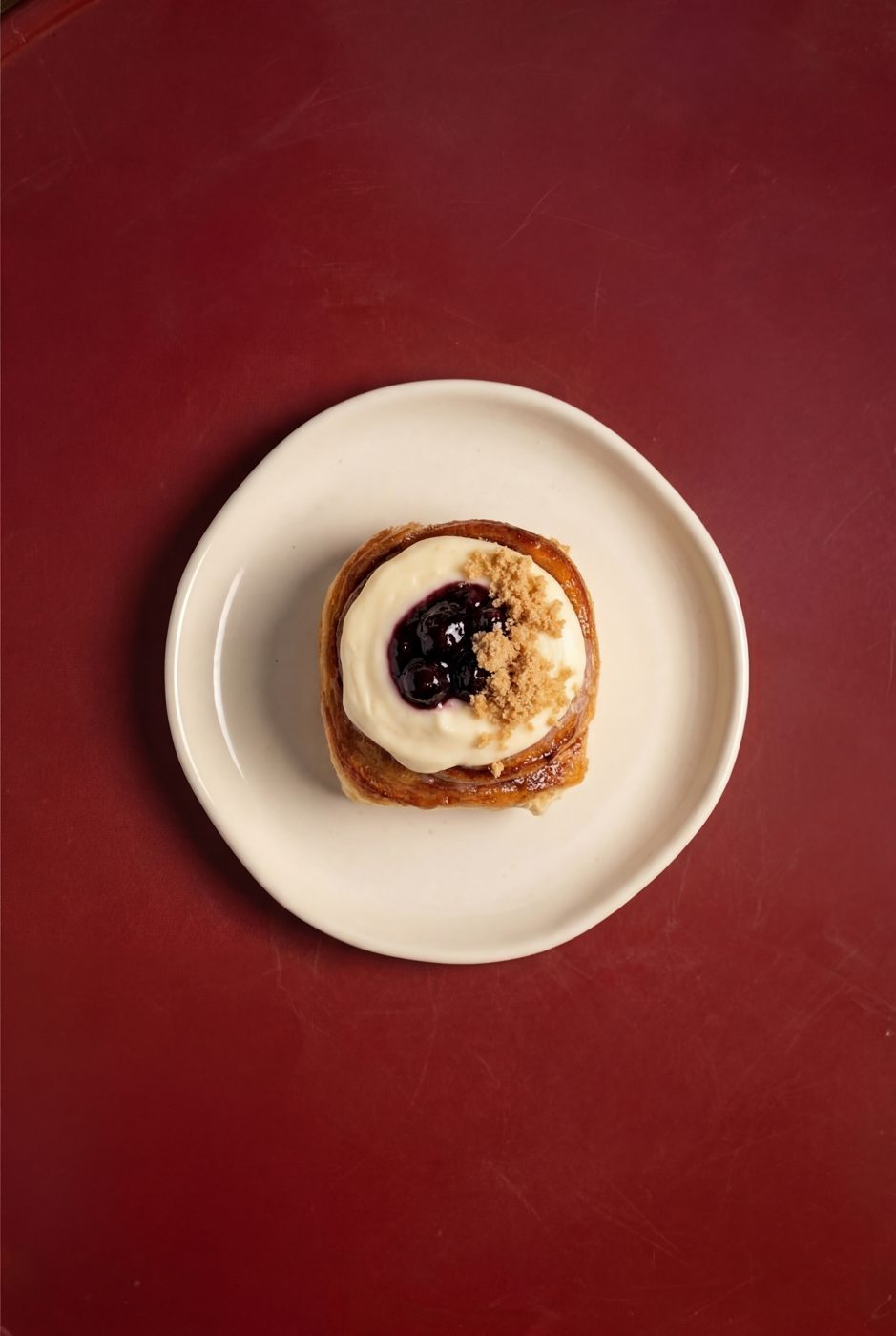
The stills sit on one colour and nothing else. Top-down, one object, hard light. Matcha in the bowl, the cake before and after the sauce, the tiramisu in the cup with the name on it, the cinnamon roll. Product photography without a studio — direction is the studio.
Studio
The same stills, moving. The matcha spooned in, the sauce poured, the dust settling on the cup — and the facade, with the right car outside. Built for the grid: they play together, they play alone.
Method
Every frame here was directed, generated and cut inside the seat. The direction is the work: the decade, the dress, the light, the cup in the right hand, the name on the screen behind the cars. The tools change every month. The eye does not.
Direction is the studio.
Dust & Verse
Speciality coffee. Riyadh. Now serving.


What left the office
A drop identity for Dust & Verse's new drink, the Einspänner — served two ways, latte and matcha. Not a launch: a department. The name and the system, the sleeve and the cards, the language, and a world to put it in — a coffee inspection department with lab coats, tungsten light and steel counters, built frame by frame for the feed.
- Drop identity
- Naming system
- Cup sleeve
- Product cards
- World & art direction
- Film
- Social campaign
The department is real
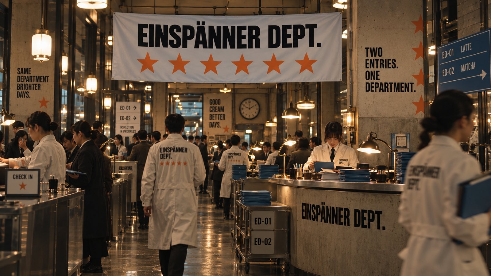
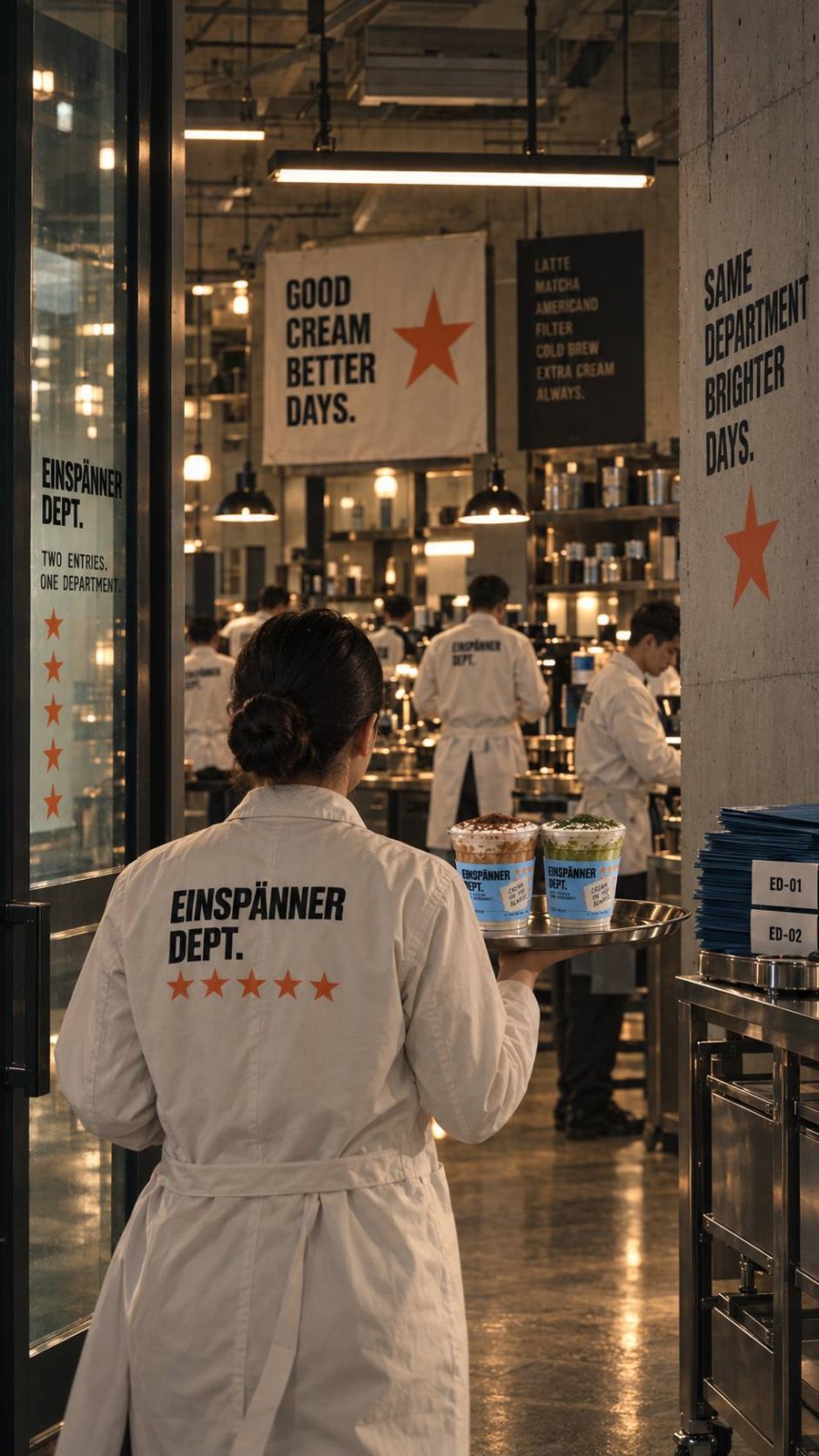
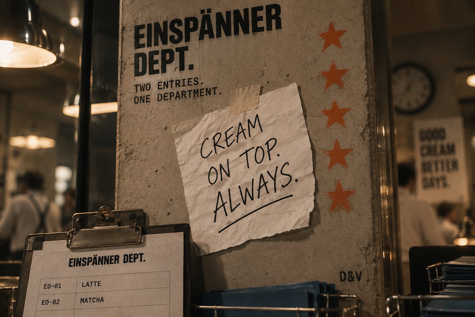
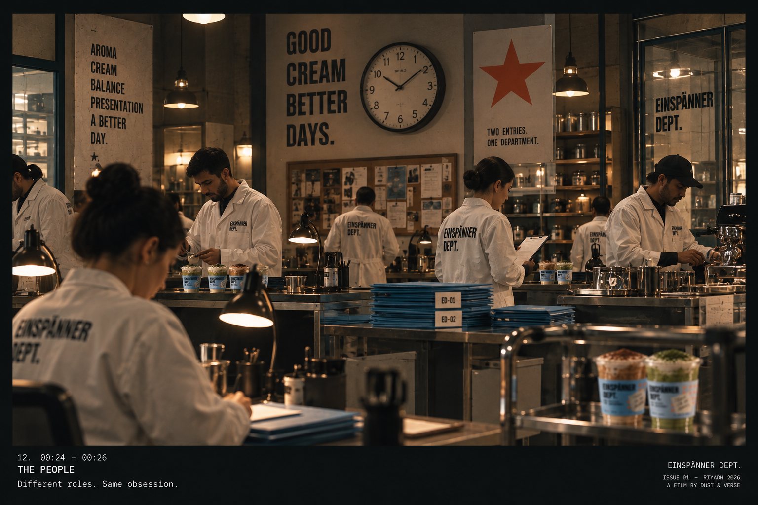
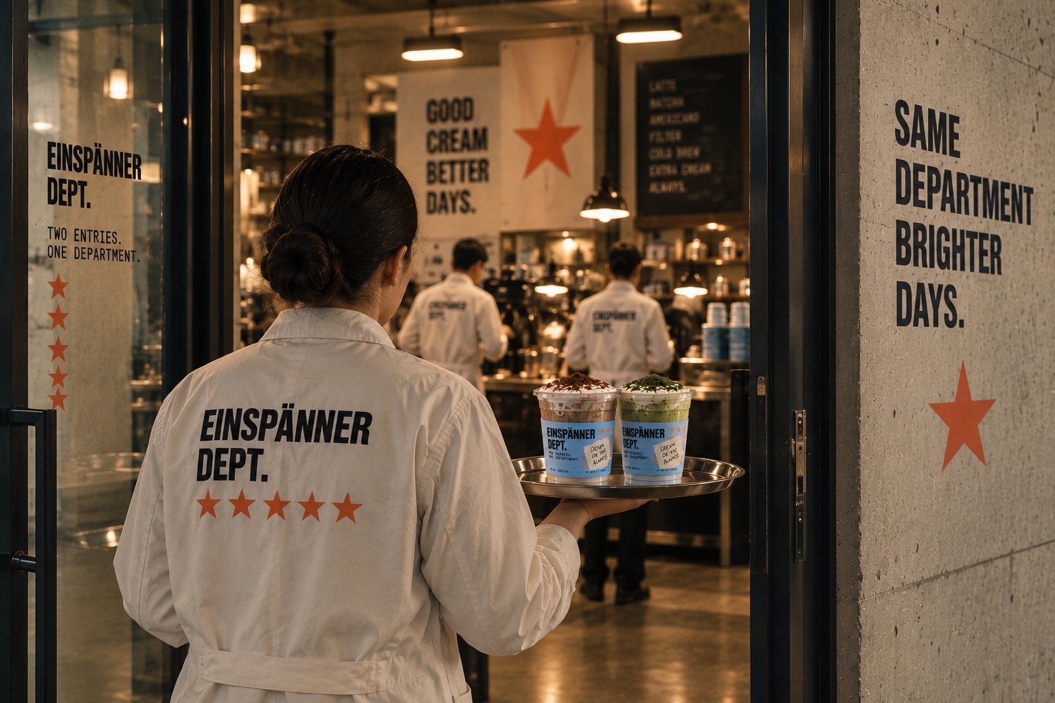
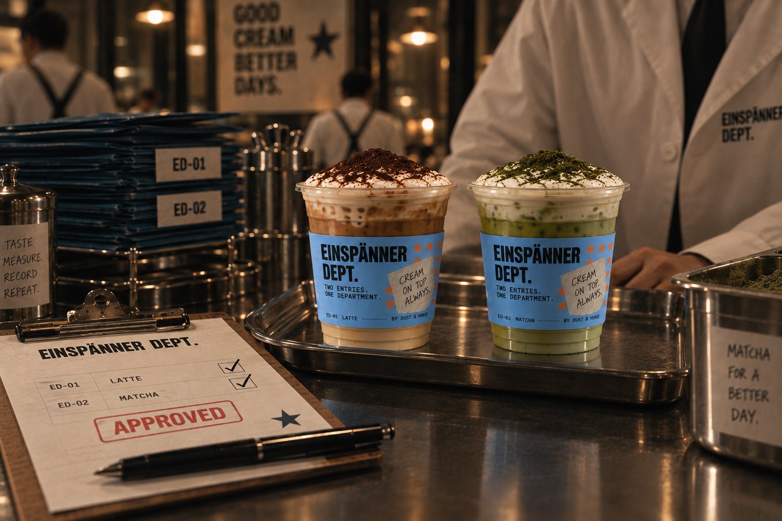
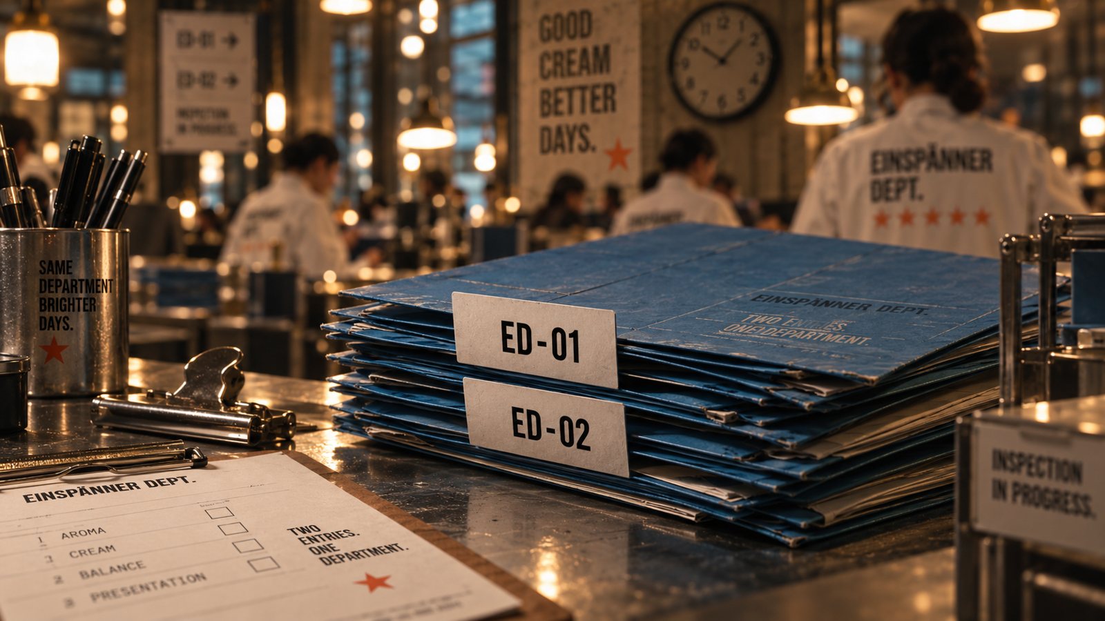
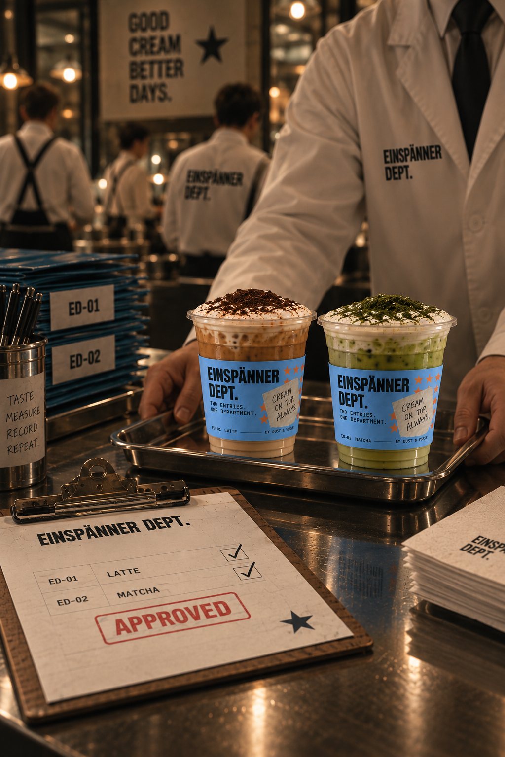
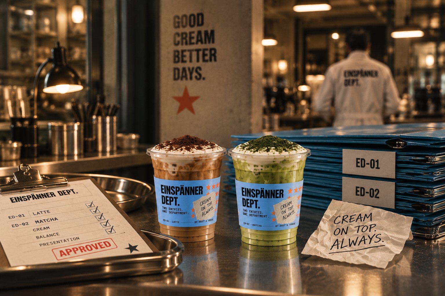
We did not stage an event or tell a story. We built an institution. A service room, a test hall, an inspection counter. People in white coats with reasons to be there. Blue folders marked ED–01 and ED–02, clipboards, a stamp that says APPROVED. Signage that lives in the room, not on top of it. Is it 2026 or 1962? The department does not say.
Sacred seriousness about the cream.
Eight films for the feed. Drag the strip. The frame in the middle plays.
The room
Dense scenes, one production design, mixed period colours. The banner over the counter, the clock, the star on the wall, the coats with the department's name on the back. Every frame is a still from a film that does not exist yet.
The inspection
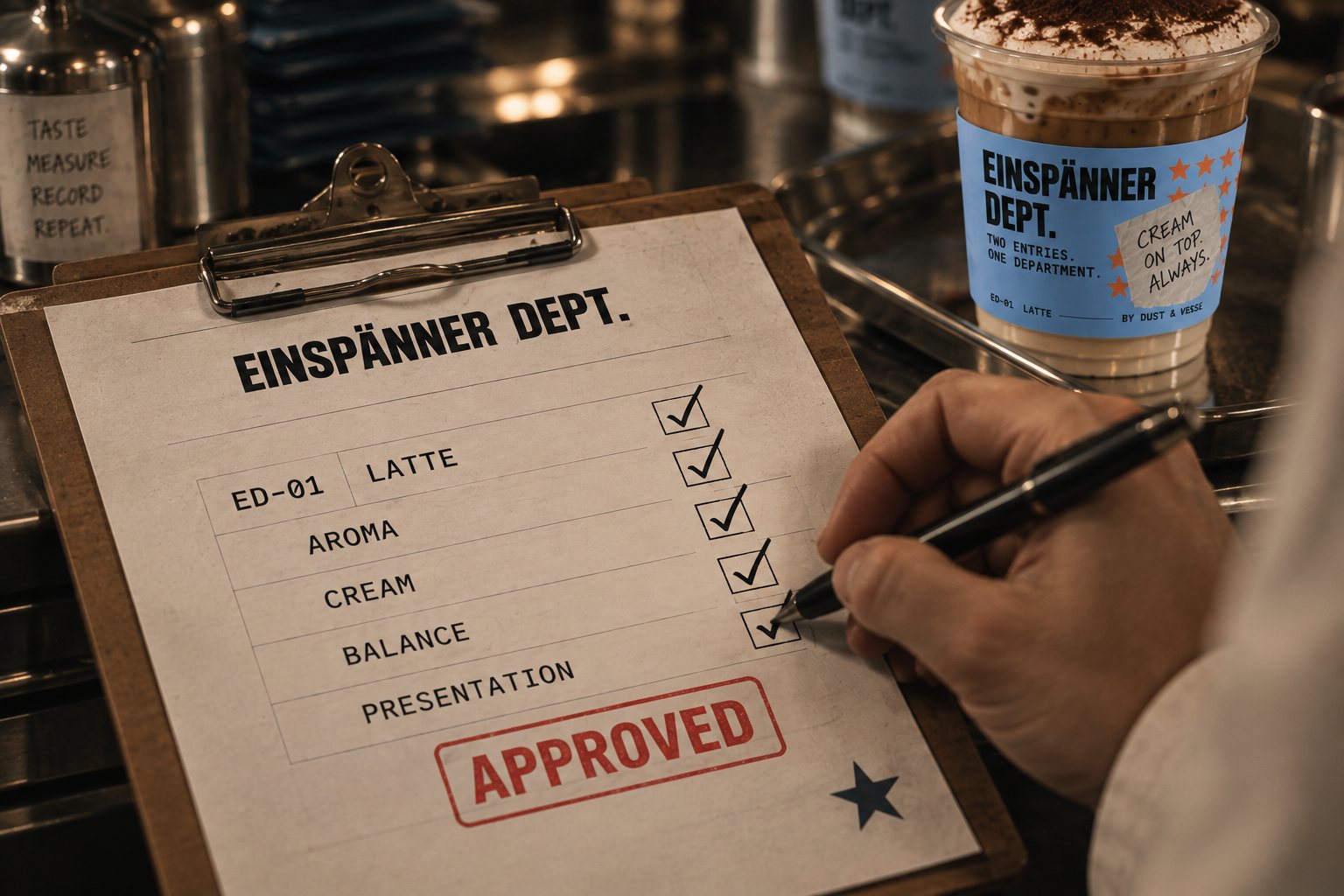
Aroma. Cream. Balance. Presentation. Four boxes on a clipboard, ticked one by one, then the stamp. The cream is checked, not tasted. Nothing leaves the counter without APPROVED on the sheet.
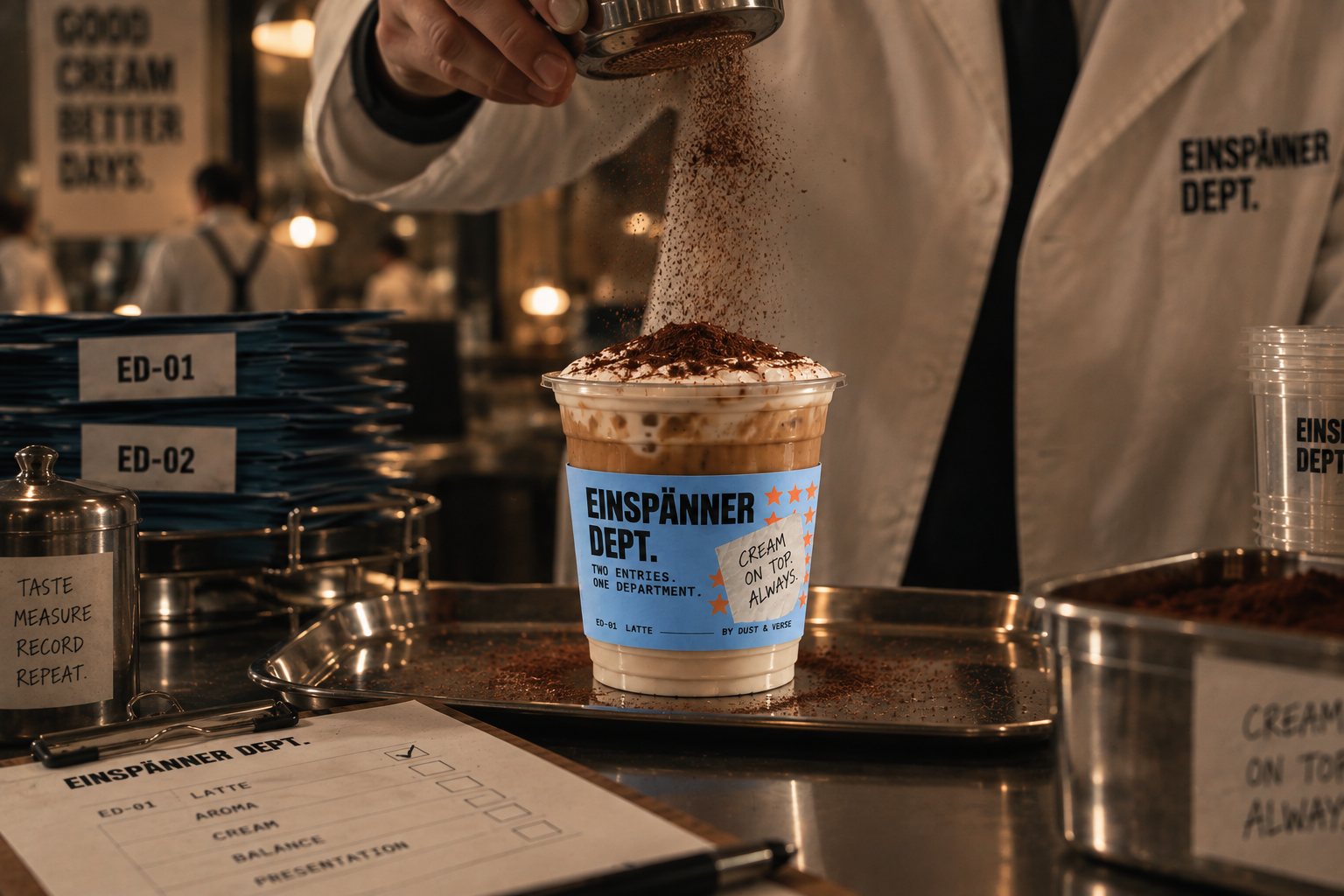
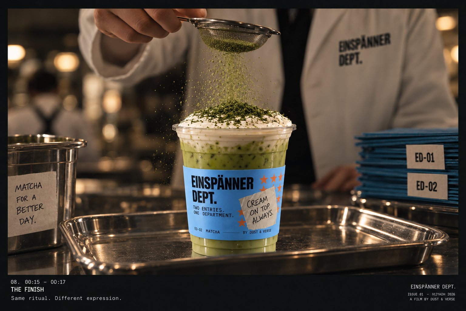
The finish
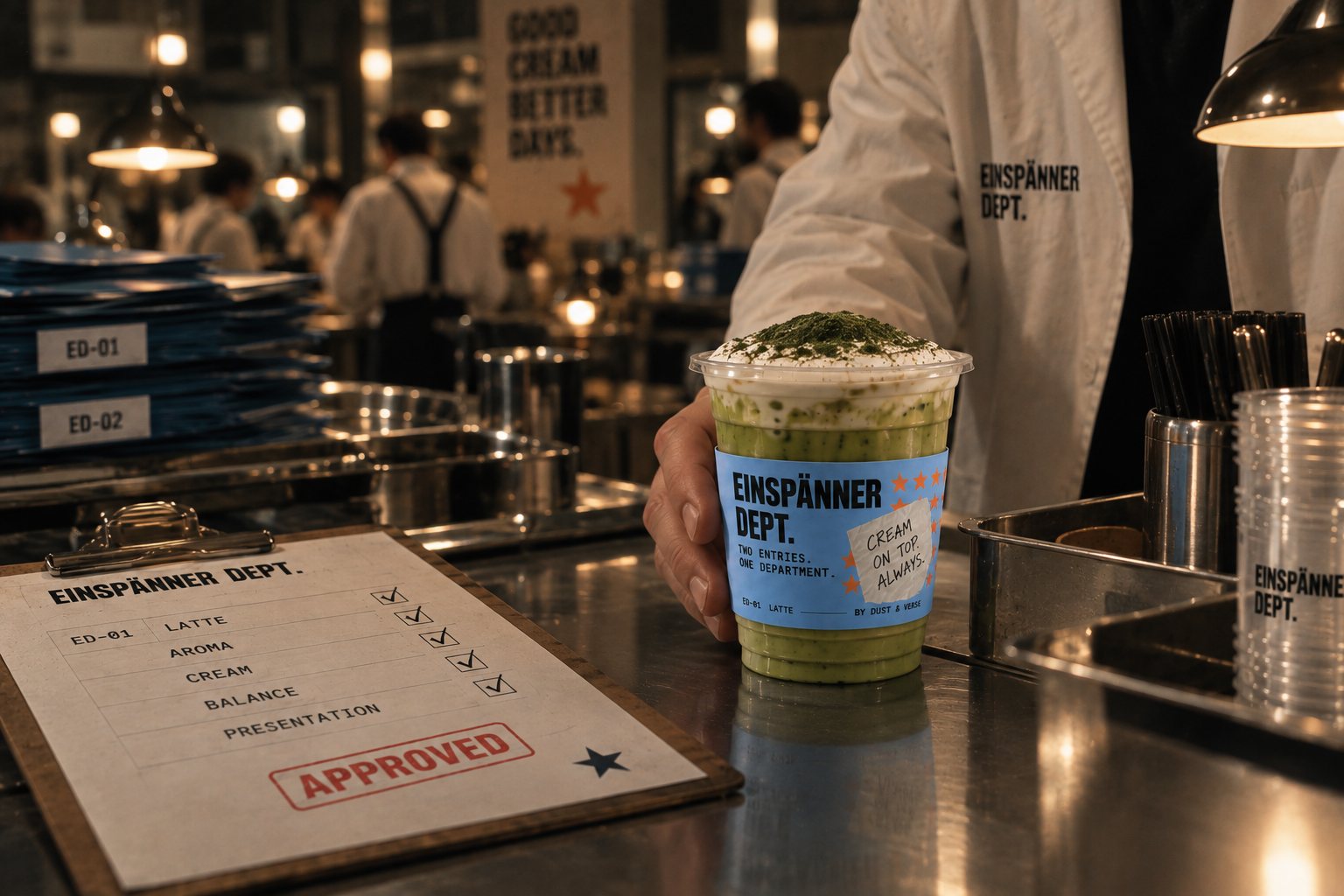
The last step is the only one anybody sees. Cocoa dust and salt on the latte, matcha dust on the matcha, through the same sieve, at the same counter. Same ritual, different expression.
Cream on top. Always.
One system, not two
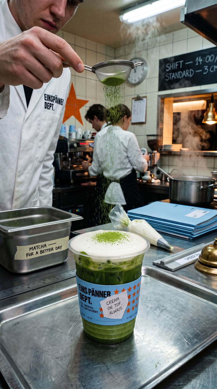
The brief had two drinks. The obvious answer was two identities — a coffee world and a matcha world. We refused it. So the latte and the matcha became two entries under one department, issued by code: ED–01 / LATTE and ED–02 / MATCHA. The code reads before the word. A third entry enters the same system without touching a line.
The matcha got no green, no "fresh" language, no second personality. Same sky, same black, same star. The only difference the system allows is the ingredient line. That one decision is what stops the campaign splitting into two campaigns.
Two entries. One department.

- Espresso
- Milk
- Signature Cream
- Matcha
- Milk
- Signature Cream
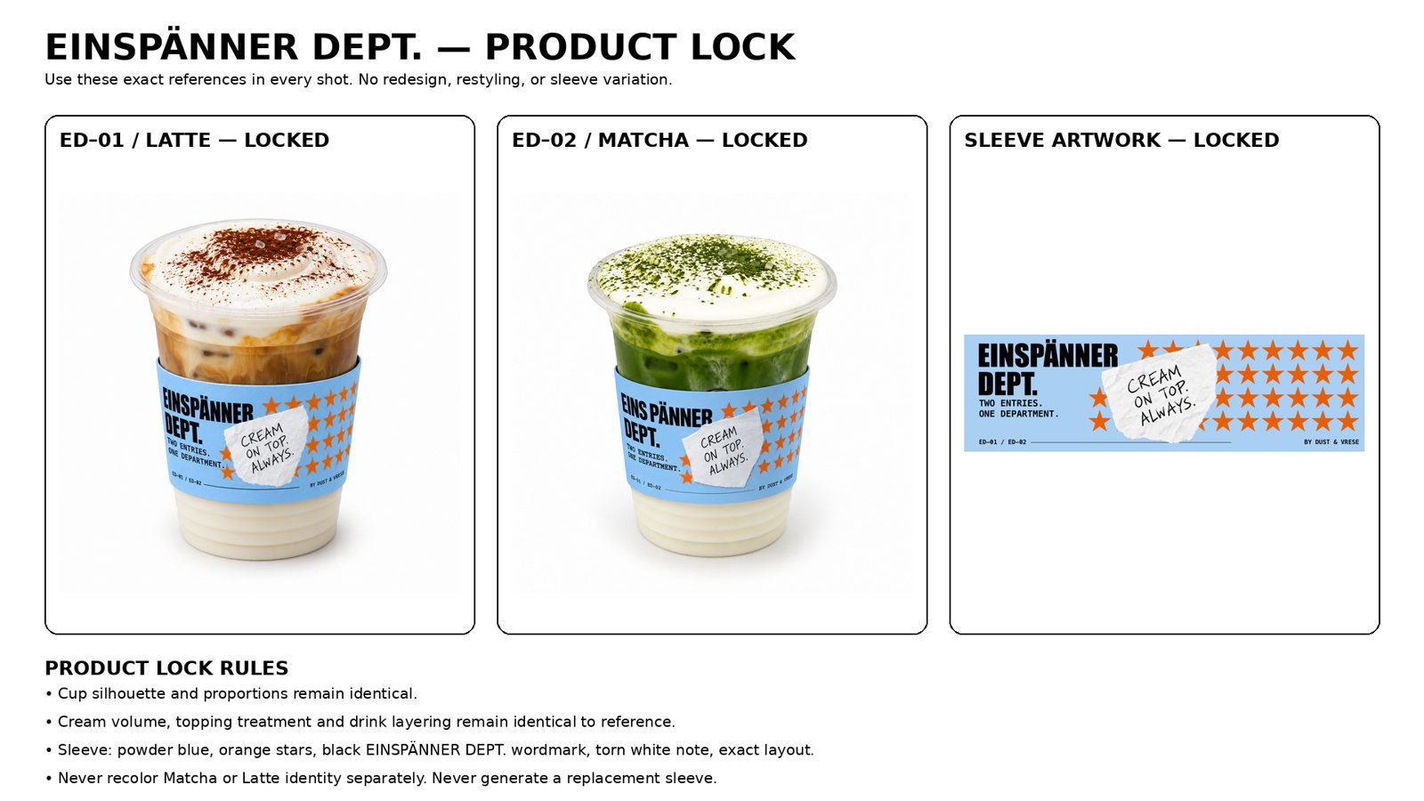
The cup says nothing
Sky-blue sleeve, orange stars, the wordmark, the torn note, and the codes — but no drink named. The cup does not say latte or matcha. The cup says from the department. Which entry you are holding is decided on the card, the menu, and in your hand.
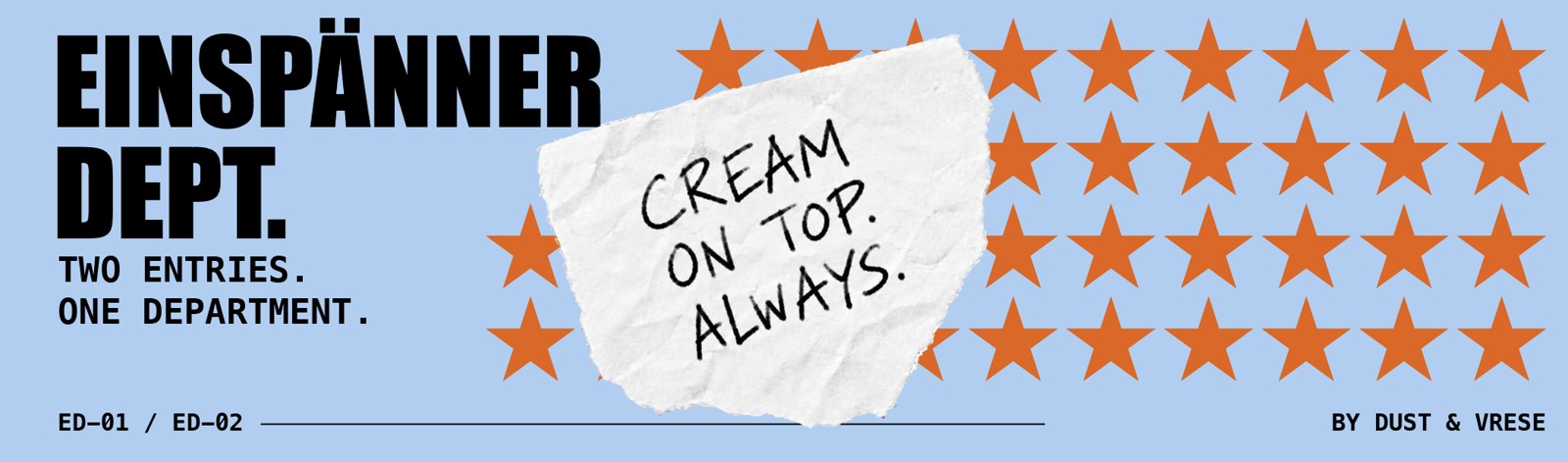
The department's vocabulary
Department. Issue. Entry. Field material. Serving. Standard. Issued. Never camp, club, community or movement. The identity of the drink is code + ingredients + cream + star. Everything else belongs to the department, not the drink.
Issue 01 · Riyadh 2026 · Now serving.